Saturday, 16. May 2026 Week 20
Passweird - Passwords too Gross to Steal
This website will create for you passwords that are not only secure*, but also so utterly repulsive that not even the most hardened criminal, identity thief, NSA agent, or jealous boyfriend would ever want to use them.
(via)
Thursday, 14. May 2026 Week 20
The Multiple URLs in Git Remote article explaines how git handles multiple URLs.
Biggest takeaway for me is that you can have git push transparently push to two URLs at the same time.
Might become handy in all the ongoing discussions about GitHub reliability…
Wednesday, 13. May 2026 Week 20
Blog Quest is a Firefox extension by Robert Alexander that quietly collects RSS feeds when you surf the web.
I like the idea of passively collecting feeds of websites I potentially find interesting, all while preserving my privacy and being unintrusive (no notifications, popups or similar).
Installed it today and already looking forward to review my surfing from time to time 😎
Saturday, 9. May 2026 Week 19
zkbro explains in a post how to configure Librewolf.
One of the mentioned add-ons catched my eye: Google Sign-in Popup Blocker
This should block the annoying sign-in with Google dialogs that popup on some websites.
As this sounds promising, I installed the add-on in my Firefox.
I briefly tested it on a site that uses the annoying sign-in with Google dialog, and this time the dialog did not appear.
To be sure I confirmed it in the developer tools where it mentioned that loading the dialog was blocked by the add-on 🎉
Well written article by Redowan Delowar, explaining how to achieve type-safe logging with Go's log/slog library.
-
Take the logger as a constructor argument.
Never reach for
slog.Default() or any package-level slog function.
-
Always use
logger.LogAttrs(ctx, level, msg, attrs...).
Not logger.Info, logger.Warn, or any of the kv-flavored helpers.
-
Every attribute comes from a helper in
internal/log/attrs.go.
Write applog.OrderID(o.ID), never slog.String("order_id", o.ID) inline.
-
sloglint enforces all three on every commit so the workflow doesn’t erode.
Thursday, 7. May 2026 Week 19
"Nothing" is the secret to structuring your work is a very nice article from Steven van Gemert outlining a simple approach to reduce mental baggage and increase focus.
The next time you begin your workday, try this: clear your work surface completely. Close all browser tabs. Create a fresh page in your notebook. Open only the one file you need.
It might feel strange or even scary at first. But notice what happens. Notice how much easier it is to focus. Notice how clearly you can see when you're actually done with something. Notice how much less mental energy you spend managing the chaos.
The world will always be messy. You can't control that. But you can control your work surface. And nothing, that small space of perfect order, is where your best work begins.
Also I felt a bit attacked by this analogy 😅
For example: closets are for storing clothes.
Chairs are for sitting on, not storing clothes.
Floors are for walking on, not storing clothes.
In the same logic, work surfaces are for working, not for storage.
Friday, 1. May 2026 Week 18
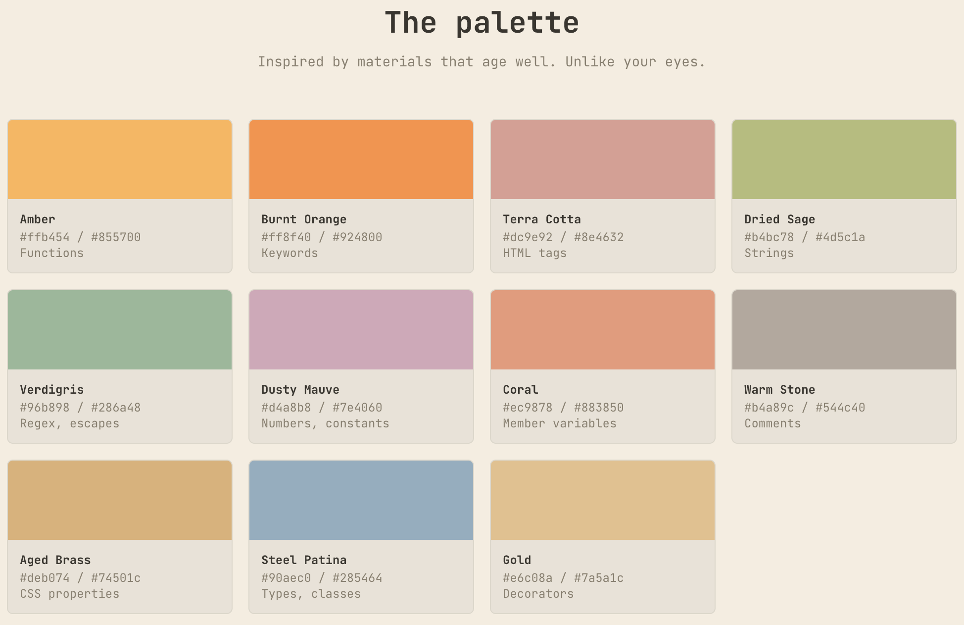
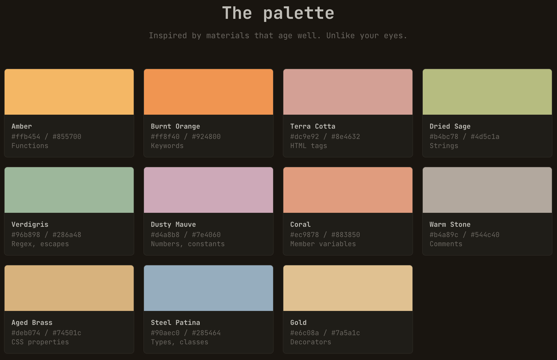
Warm Burnout — A warm, contrast-audited color theme suite. Mostly warm palette, one cool type accent, WCAG AAA dark and AA light variants. For developers who are already burned out but still have deadlines.
Built on one premise: your eyes have been bullied enough by radioactive blue themes. Warm Burnout is a mostly warm syntax palette with one cool steel-blue accent for types and WCAG-audited contrast.

Wednesday, 29. April 2026 Week 18
LangApp is a cute little webapp to learn Bernese Swiss German (Bärndütsch). 🧸
Thursday, 16. April 2026 Week 16
Some things I’ve learned/am learning:
• 99% of things aren’t about you.
• Only you can complete you.
• Let people enjoy things.
• Kindness is imperative.
• Actions > words.
• Stop, look, & listen.
• Love others. You’ll grow.
• Laugh like it’s your job.
• Never stop learning.
(via)
Sunday, 12. April 2026 Week 15
Email address obfuscation: What works in 2026?
Here are some of the best techniques for keeping email addresses hidden from spammers—along with the statistics on how likely they are to be broken.
(via)