More statistics tuning
After last weeks work on the statistics page, I was still not completely happy with how it renders in text-only browsers.
Thus the idea of adding <th> headers to the two rows of numbers.
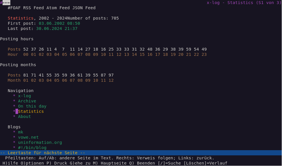
This turned out quite well and helped to make things more clear as you can see in this screenshot.

I initially wanted to use the :first-child selector to hide these additional table headers in graphical web browsers.
But didn't get it right with the first try, so the header still showed.
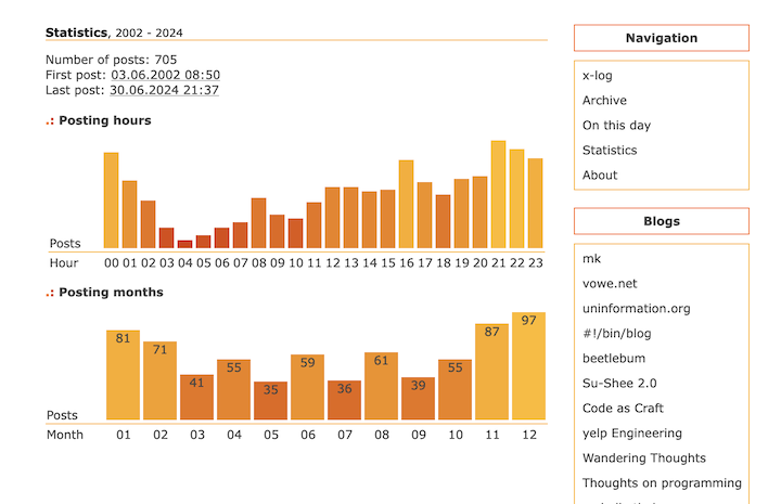
This actually didn't look that bad, and so I decided to keep the headers visible and styled them nicely so they integrate well with the rest of the statistics table.
This is how the statistics page now looks in a graphical web browser.
