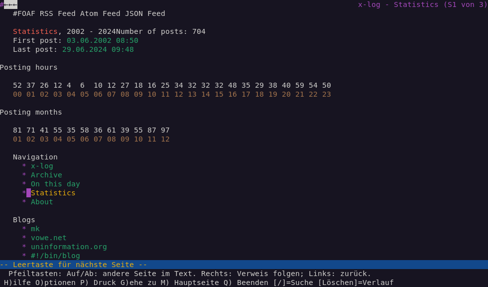
Improved text-only UX
Some time ago I read this article from Dan Q about testing your website in a text-only browser (Lynx, which is the oldest web browser still being maintained, started in 1992).
Surfing through my blog with Lynx, I was positively surprised in how well the content and structure was presented.
Seems like the modernization and simplification efforts of the HTML code behind the scenes paid off well.
The statistics page though was not really usable, it was displayed as a random soup of numbers due to the usage of unstructured <div> tags for the elements of the visual graphs.
To fix this I reverted back to using <table> tags to structure the data.
This way the layout degrades gracefully in text-only browsers and provides a minimally structured representation of the data.
And I applied the newly learned CSS skills (linear-gradient backgrounds) to achieve the same visual graph as beforehand when opening the page in a regular browser.
